")

Mobile Optimization is not merely a trend; it is essential in a world where smartphones are practically an extension of our hands. Your audience is probably using a mobile device to access your content, regardless of whether your company is in e-commerce, services, or education. You risk losing clients before they have a chance to learn about your business if your website isn’t prepared to make an impression in that limited time.
The purpose of this article is to educate you about mobile optimisation and its importance in boosting your business performance, conversions, and credibility.
What is Mobile Optimisation and Why Does it Matter
Mobile optimisation means designing and structuring your website efficiently to ensure it works well and looks great on mobile devices. It is essential to provide mobile phone users with a smooth experience when accessing your website. A well-optimised site ensures your website loads faster and is easy to navigate. Also, it provides effortless readability, smooth interactions and conversions.
In short, mobile optimisation increases your mobile conversion rate while improving the user experience and brand perception. It is important to understand that your website is not just competing with other websites; rather, it is competing for your users’ attention.
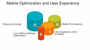
What is Mobile SEO and a Responsive Website?
Mobile SEO means the process of optimizing a website so that it performs well on mobile devices and ranks higher in search engine results for mobile users. Since a large percentage of searches now occur on smartphones, search engines like Google use mobile-first indexing, which means they primarily evaluate the mobile version of a website when ranking results.
SEO is a key ranking factor for search engines like Google. Google mainly looks at your site’s mobile version to determine its ranking. A strong mobile SEO includes a responsive design that adapts to all screen sizes, fast-loading pages since speed matters, optimised images to prevent pixel-heavy issues, and readable text and clickable buttons to avoid zoom issues. As you get mobile SEO right, your business becomes more visible to people on the go, drawing in traffic that converts.
A responsive website is essential for mobile optimisation. Responsiveness means your website automatically adjusts its layout, content, and elements based on the screen size, whether it’s a phone, tablet, or desktop. To create a responsive website that users love, use flexible grids and layouts instead of fixed ones. Then, choose images that resize easily. Design your website for mobile screens. Start by designing for small displays and eventually move to larger screens. Additionally, regularly test on different devices and browsers. When your website feels natural on any device, users stay longer, engage more, and convert faster.
Key elements of Mobile SEO include:
- Mobile-friendly design that adapts well to small screens
- Fast page loading speed on mobile networks
- Easy navigation with readable text and clickable buttons
- Optimized images and media to reduce load time
- No intrusive pop-ups that disrupt the mobile experience
Benefits of Mobile SEO
- Better search engine rankings
- Improved user experience
- Lower bounce rates
- Higher engagement and conversion rates
Focus on Mobile Site Performance
No one likes a website that takes forever to load. A slow website can frustrate users. Frustration among potential customers of your product is not an ideal situation, definitely not the one you want. Undoubtedly, your mobile site performance can significantly impact your business. A one-second delay in page load time can cut conversions by nearly 7%. That’s how important speed is. There are a few simple ways to improve mobile site performance. You can compress images and files using WebP or AVIF to reduce load times, or store temporary data for repeat visitors using browser caching. Redirects and pop-ups slow things down and frustrate users, so minimising them will help. Moreover, regularly test your site speed with tools like Google PageSpeed Insights or GTmetrix.
Optimising your pages for speed helps users reach their destination quickly and with less frustration.
Prioritise Mobile Usability
Mobile usability aims to improve navigation, reading, and interacting with your site on mobile devices. Excellent information does not guarantee higher traffic on your website; visitors are unlikely to use it if it feels awkward on a mobile device. Key mobile usability upgrades include simplified navigation with clear labels, touch-friendly buttons large enough for thumbs, and a readable font size (at least 16px for body text). Also, accessible forms should require minimal input.
By improving mobile usability, you show your visitors that you value their time and user experience.
Speed Mobile Pages for Better Engagement
Our society craves immediate gratification. Your visitors will leave if your mobile pages are not responsive. Google’s Core Web Vitals use measurements like Cumulative Layout Shift (CLS) and Largest Contentful Paint (LCP) to measure how fast and stable your website is.
To speed up your mobile pages, enable lazy loading for images and videos, and reduce JavaScript bloat, since too many scripts slow your site down. It is wise to consider using Accelerated Mobile Pages (AMP) if it fits your business and to preload important resources to help ensure faster functionality.
Optimise for Mobile Conversion Rate
In the end, mobile optimisation should lead to a higher mobile conversion rate. A great mobile-optimised website should lead to higher customer interaction rates. Whether it is a purchase or registration to know more. There are a few simple steps that will help you boost your mobile conversion rate:
- Simplify the checkout processes. Fewer steps mean fewer drop-offs.
- Add click-to-call buttons for easy communication.
- Use mobile-friendly calls to action. Keep them bold, visible, and convincing.
- Ensure forms support autofill and require minimal typing.
- Allow mobile wallets like Google Pay, Apple Pay, or UPI for easy payments.
The idea behind these steps is that every tap should lead users closer to their goals, not into confusion. Cutting unnecessary steps remains a key way to improve the customer experience on your website.
Enhance Mobile User Experience (UX)
Design, usability, and emotion are all combined to provide a smooth mobile user experience. It all comes down to how users find your website—intuitive, simple, and fun. Some effective UX strategies include focusing on essential information and designing it for one-handed use, keeping buttons and key actions within thumb reach. Include small animations or feedback cues to make the site feel lively, and offer dark mode —it’s easier on the eyes and aligns with user expectations. Maintaining consistent branding is also important so users can recognise and trust you immediately. Earning users’ trust is essential for lead generation and overall business growth.
Test, Monitor, Repeat
Optimisation is a continuous process. Regularly monitoring the performance of your mobile website is non-negotiable. Studying conversion, bounce rates, and session lengths, and adapting your approach according to your findings. As devices and trends change every day, you need to keep up, too.
Conclusion
Today, the success of your company depends on how you interact with your mobile audience. From responsive design and mobile SEO to enhancing mobile speed and usability, every element plays a crucial role. People don’t want a slow website; rather, they need a fast, responsive mobile experience that feels like a warm welcome.
Our Teamlogy social media team has the prowess to improve your social media presence. They thrive in SEO optimisation, mobile UX and content creation. To take your social media game to the next level, connect with our team, and they will explain in detail how we will help your cause.


